Pictures and Fonts
Choosing the right ones for your message
Pictures and Fonts
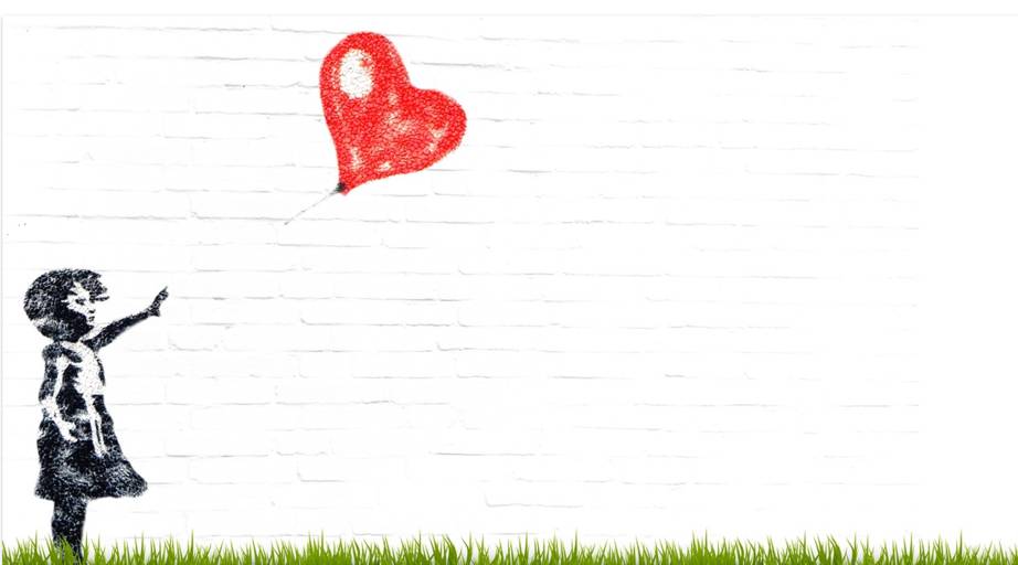
You’ve no doubt heard it said that pictures take the place of a thousand words. Pretty nifty if you're short on time. However, you need the right pictures to convey those thousand words and it takes time to choose them. So here are a few pointers.
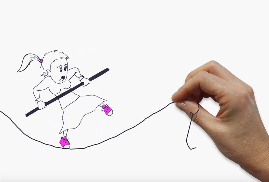
People are most responsive – and more likely to engage – with images that are laid out in a clean and simple way. If people are presented with too much information, it can overwhelm them and force their brain to switch off. So be thoughtful and selective and know what you want to convey.
You want to arouse emotion; stimulate engagement; illustrate your concept and generally “show” as you tell. So be crystal clear about what you want. And what your audience wants.
There are many free and not-so-free stocks of pictures on the net, as no doubt you already know. Just google them up and away you go. Watch out for those overused images though.
Fonts are another matter. There are some that are much better for your web and whiteboard presentations than others. You might want to take note of these:
Top 7 Most Used Fonts Used by Professionals in Graphic Design
1. Helvetica / Helvetica Neue.
2. Trajan. ...
3. Garamond. ...
4. Futura. ...
5. Bodoni. ...
6. Bickham Script Pro. ...
7. Frutiger. ...
Though many Graphic designers might beg to differ
Fonts have been shown to impact everything from your political beliefs, how introverted or extraverted you are and how long someone will read an article for.
Colour in fonts and images has a big impact too.
A recent study from Georgia Tech examined over 1,000,000 Pinterest images over 3 recent years and looked at the colour trends between the highest and lowest shared images.
· Red, Purple and Pink promote sharing
· Green, Black, Blue and Yellow all stop people from sharing
In your whiteboard animations don’t overdo your colours. 3-4 will work well.
Speak to people’s emotions with your design. Make your visuals relevant to your message and most of all, make them relevant to your audience. It’s not all pretty pictures here. It’s designing to engage.

Contributed by J Jordan for Voiceover.com.au - Making your words sound wonderful.
Visit us for voice over services - Domestic and International.
www.voiceover.com.au | +61-2-9957-4208 | Have a great day!
Related Articles